Introduction:
In the realm of data analysis, the process of interpolation emerges as a powerful tool to fill the gaps and unravel the missing threads of information. This article delves deep into the intricacies of data interpolation, shedding light on its significance, techniques, real-world applications, and practical examples. Whether you're a data enthusiast or a professional seeking clarity, this comprehensive guide will navigate you through the art of interpolation.
Understanding Data Interpolation:
At its core, data interpolation is the art of estimating values between existing data points to create a coherent and continuous dataset. This technique is akin to completing a puzzle by filling the missing pieces, enabling a smoother analysis and visualization experience. Think of it as connecting the dots to form a more insightful picture.
Types of Data Interpolation Techniques
1. Linear Interpolation: Imagine plotting stock prices over time. Linear interpolation joins the dots with straight lines, providing a basic yet effective estimation between two known data points.
2. Polynomial Interpolation: Consider a scenario where you're studying population growth. Polynomial interpolation uses a curve-fitting approach to model the data, capturing complex trends.
3. Spline Interpolation: Visualize terrain elevation data. Spline interpolation creates smooth curves between data points, avoiding abrupt changes and ensuring a realistic representation.
4. Kriging Interpolation: Think of soil quality mapping. Kriging considers spatial correlation to predict values at unsampled locations, making it ideal for geospatial analysis.
5. Nearest Neighbor Interpolation: Picture temperature records across cities. Nearest neighbor interpolation assigns the nearest known value to an unknown point, preserving local characteristics.
Real-World Applications:
1. Environmental Studies: Interpolating weather data helps predict patterns for accurate climate modeling.
2. Geographical Mapping: Creating elevation maps with interpolated data for comprehensive terrain visualization.
3. Medical Imaging: Interpolation assists in generating detailed images from medical scans, aiding diagnosis and treatment planning.
Illustrative Examples:
1. Linear Interpolation: Estimating population figures between two census years.
2. Polynomial Interpolation: Predicting sales growth trends for a product based on historical data.
3. Spline Interpolation: Representing smooth curves for heart rate variability over time.
4. Kriging Interpolation: Mapping pollutant levels across a city for targeted environmental policies.
5. Nearest Neighbor Interpolation: Identifying pollution levels in areas lacking direct measurement.
Optimizing Data Interpolation:
1. Quality Data: Start with accurate and reliable source data to ensure meaningful interpolation.
2. Method Selection: Choose the right interpolation method based on data distribution and context.
3. Visualization: Plot original and interpolated data to assess accuracy and identify anomalies.
4. Avoid Overfitting: Opt for moderate-degree polynomials to prevent overfitting and maintain generalization.
Programming EXAMPLES:
1-D data or Matrix
Interpolating 1D data or a matrix along one dimension in MATLAB can be achieved using the interp1 function. Here's an example code that demonstrates interpolation for 1D data:
% Create a sample 1D data
x = 1:5; % Original X values
y = [2, 4, 1, 5, 3]; % Corresponding Y values
% Define the new X values for interpolation
new_x = 1:0.5:5; % New X values
% Perform linear interpolation
interpolated_y = interp1(x, y, new_x, 'linear');
% Display the original and interpolated data
figure;
subplot(1, 2, 1);
plot(x, y, 'o-');
title('Original 1D Data');
xlabel('X');
ylabel('Y');
subplot(1, 2, 2);
plot(new_x, interpolated_y, 'x-');
title('Interpolated 1D Data');
xlabel('New X');
ylabel('Interpolated Y');
In this code, we create a sample 1D data set with original X and Y values. We then define new X values new_x for interpolation. The interp1 function is used to perform linear interpolation of the Y values onto the new X values, resulting in the interpolated_y values.
The code concludes by displaying both the original and interpolated 1D data using the plot function. This example demonstrates how to interpolate 1D data using linear interpolation. You can replace 'linear' with other interpolation methods like 'spline' or 'pchip' as needed.
Run this code in MATLAB to visualize the original and interpolated 1D data.
You should get this:
As you can see here, the interpolated matrix (right-hand side) has more data than the original ones because we have increased the step or the resolution from 1 unit of x to 0.5.
2-D data or Matrix
interp2 function to interpolate a 2D matrix:x = 1:5; % X values
y = 1:5; % Y values
[X, Y] = meshgrid(x, y);
original_matrix = sin(X) + cos(Y);
% Define the new grid for interpolation
new_x = 1:0.5:5; % New X values
new_y = 1:0.5:5; % New Y values
[NewX, NewY] = meshgrid(new_x, new_y);
% Perform bilinear interpolation
interpolated_matrix = interp2(X, Y, original_matrix, NewX, NewY, 'linear');
% Display the original and interpolated matrices
figure;
subplot(1, 2, 1);
imagesc(x, y, original_matrix);
title('Original 2D Matrix');
xlabel('X');
ylabel('Y');
colorbar;
subplot(1, 2, 2);
imagesc(new_x, new_y, interpolated_matrix);
title('Interpolated 2D Matrix');
xlabel('New X');
ylabel('New Y');
colorbar;
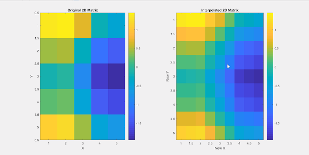
In this code, we start by creating a sample 2D matrix original_matrix using sine and cosine functions. We then define a new grid for interpolation using the meshgrid function. The interp2 function is used to perform bilinear interpolation of the original_matrix onto the new grid, resulting in the interpolated_matrix.
The code concludes by displaying both the original and interpolated matrices using the imagesc function. This example demonstrates how to interpolate a 2D matrix using linear interpolation. You can replace 'linear' with other interpolation methods like 'cubic' or 'nearest' as needed.
Run this code in MATLAB to visualize the original and interpolated 2D matrices like this:
Conclusion:
Data interpolation bridges the gaps in datasets, transforming them into insightful and coherent resources for analysis. This article navigated through interpolation techniques, illustrated real-world applications, and offered practical examples. Armed with this knowledge, you're poised to extract deeper insights from your data, driving informed decisions and enriching your analytical journey.
For better understanding, watch the video below and go practice !
#Data Interpolation #Techniques #Examples #Linear Interpolation #Polynomial Interpolation #Spline Interpolation #Kriging Interpolation #Nearest Neighbor Interpolation #Applications #Data Analysis #Visualization #Best Practices.
-myresearchxpress


